Overview
Difficulty finding desired vending machine items and COVID-related concerns about high-contact surfaces are leading to frustration, limited options, and hesitation among vending machine users on campus. We designed a solution that gives users better access and success when using vending machines without detracting from their normal functionality.
Team Members
Hari Rathnam, Shivansh Shekhar, Carly Minow, Junhee Lee
Duration
10 weeks
My Role
Product Designer
Problem Space
On a campus as big as UW's, locating a vending machine can be like finding a needle in a haystack. While there are many machines, it's not always obvious where they can be found, or if they even exist in a certain building. Furthermore, locating a vending machine that offers one's desired snacks or drinks can be a challenge, leaving a user hungry and time wasted. While machines claim to accept multiple payment methods, inconsistency in this matter results in frustrating failed transactions and lost business. Recently, COVID-19 has raised concerns about virus transmission via high-contact surfaces, leading to hesitation among some users who now feel uncomfortable touching a vending machine's physical buttons.
Design Question
How might we create a better vending machine experience that addresses user frustrations around limited options, difficulties finding machines, and concerns about hygiene?
Our Solution
Get snacks on the go, hassle-free
Dawg Treats is a vending machine app that lets users easily locate and purchase snacks on the go. With real-time inventory updates and touchless ordering, users can quickly get the snacks they want without any hassle. Say goodbye to frustration and wasted time, and hello to convenient snacking.
Our mobile application eliminates in-person interaction prioritizing health safety, improves remote access, and provides convenience for customers.
Our Design Process
🔬
Research
Interviews, Personas, Journey Map
✏️
Ideation
Heuristic Evaluation, Design Requirements
🎨
Prototyping
Information Architecture, Annotated Wireframes
📱
Evaluation
Usability Testing, Interactive High-Fidelity
Research
Interviews
To begin our project, we conducted exploratory user interviews to understand the issues currently impacting UW's vending machine users. Each team member interviewed a student who has used the on-campus vending machines, and our questions revolved around motivations, pain points, and processes regarding snack availability, ease of use, payment problems, and potential features for a vending machine app.
Key Takeaways:
Machine stock across campus is inconsistent. Some machines offer vastly different snack options than others, and at different quantities.
Not all payment methods on the machine are always accepted, but the buying process is usually straightforward.
All users interviewed wished for better ways to locate their desired snacks.
Our interview findings gave us the ability to define our initial vending machine user goals, desires, and expectations.
“I purchase from the vending machine almost every day”
“Finding a vending machine that actually has what I want can be difficult”
4 UW Students Interviewed
“I’m pretty concerned about pressing the physical buttons ever since the pandemic began”
Personas
After our interviews, we consolidated our findings into two realistic user personas. Our fictional users, Maya and Ryan, each had different design needs that our final product would have to simultaneously achieve. When we referenced these personas, we were able to assess if our design ideas aligned with their goals, gain inspiration, spot developing pain points, and discover the gaps in which we could create solutions. Now that we had a framework, our team considered how existing design solutions contributed to our personas.
User Journey Map
With our research phase nearing completion, we created a user journey map to visualize the experience of using a vending machine at UW from hunger to having a snack in hand. User journey maps display the user's main interactions with a problematic technology (called "touchpoints"), the activities are done to complete each interaction, and their mental and emotional responses to said activities. Maya's lowest emotional moments set the foundations for our main app functions as we started the design phase.
Ideation
Heuristic Evaluation
We completed 4 competitive analyses of solutions that existed for our design problem. Our analyses focused heavily on the positives and negatives of existing vending machine software options, highlighting a mix of owner-focused and user-focused technologies. By recognizing where our competitors fell short, our team was able to identify inclusive design opportunities and existing pain points.
Key Takeaways:
(4 of 4) Vending machine inventory was difficult to locate/not easily accessible
(4 of 4) Lack of iconography and visual aids
(3 of 4) Busy and crammed UI
(2 of 4) Had a map of where vending machines were located
(2 of 4) Not available for download in the United States
Competitor: Pay4Vend
Competitor: VendSoft
Competitor: Vendron
Competitor: PayRange
Design Requirements + Storyboard
Based on our research insights, we then outlined our design requirements to best cater to our user’s needs and desires. Defining the requirements was helpful in visualizing our solution as we came out with a comprehensive list of requirements we found to be most beneficial and feasible. These are followed by our storyboards because they show the user scenarios where our design is implemented.
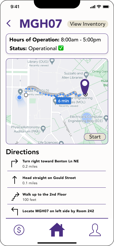
Identify locations and give directions to the vending machines on campus
Provides information on the hours of operation and payment methods accepted by the vending machine
Modify the payment process to allow for in-app payment capabilities, bypassing payment hardware on the machine
Require users to hold their phone up to the machine to confirm use and pay
Prototyping
Information Architecture
The information architecture is a diagram that displays the hierarchy and flow of how a user would interact with different pages within our mobile application. It helped us to see the complete functionality of the solution and the visual organization of the elements that would assist in the function. By creating the information architecture diagram, we were able to identify areas of confusion in the interaction flow and modify frames accordingly. After clearly seeing the organization of frames we needed to build after creating the diagram we were able to work on wireframing and prototyping.
Annotated Wireframes
As we designed our low-fidelity prototypes, we added annotations to the wireframes to be used in our usability testing. Potential users could use these comments to better understand features and evaluate the prototypes. Throughout our prototyping, our main goal was to brainstorm ways to create a familiar user experience without overloading users with too much information.
Home Page Previews
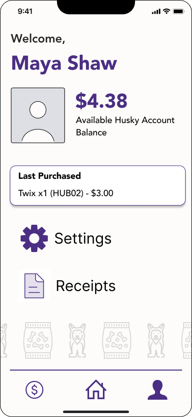
I was concerned about the number of features available in our solution and how users would know what is available. I solved this by creating a content-packed home page. By presenting small cards/previews of the different features (search, map, etc.) users are able to understand what Dawg Treats can be used for at a quick glance with control and confidence.
Live Navigation
During our user interviews, many users brought up how traditional navigation methods may not be specific enough to locate vending machines within buildings. I solved this by including step-by-step directions and live navigation within our application that goes further than arriving at a building.
Shopping Cart
The ‘Scan’ feature allows users to pull up a shopping cart for specific vending machines and purchase items in a manner similar to popular e-commerce and food delivery applications.
Evaluation
Usability Testing
To test the efficiency of our prototypes and get valuable feedback we recruited 4 relevant participants to interact with our Low-Fidelity Prototype.
(4 of 4) Completed the checkout process in 60 seconds or less
(4 of 4) Deemed the ‘Live Navigation’ as a feature they would use to locate vending machines across campus
(3 of 4) Found the contactless payment method to be confusing if someone was using the vending machine physically at the same time
(2 of 4) Found no purpose with the designated ‘Search’ page with the search bar being on the Home Screen
Key Takeaways
Compared to competing solutions, our application demonstrated significant efficiency.
All of our implemented features aided customers’ pain points
The Scan + Buy page needs to be reworked to account for in-person or simultaneous users.
Usability Test performed on Zoom with Remote Access given to the participant
Revisions
75% of our participants found the contactless ordering to be confusing and needed to be reworked.
Returning to our design goals, we wanted to present users with the familiar experience of ordering from a physical vending machine in our final solution. As a result, we modified the scope of our Scan/Buy feature to be more closely related to an actual vending machine. This way users could still purchase items without touching high-contact surfaces while following the proper customer priority.
Old Purchasing Flow
→
New Purchasing Flow
High Fidelity Prototypes
After revision, we were able to finalize our high-fidelity frames, focusing on Gestalt’s Principle of Proximity and creating an interactive prototype on Figma.


Reflection
Throughout this project, we gained a deeper understanding of the importance of conducting user research and testing. By gathering feedback from potential users, we were able to better understand their needs and pain points, and make design decisions that would ultimately lead to a more successful product. We also learned the value of remaining flexible throughout the design process, as we often had to pivot our approach based on new insights and feedback.
One of the biggest challenges we faced was finding ways to address the needs of different user groups, including those with physical disabilities and varying levels of technological proficiency. It was important to strike a balance between meeting these diverse needs while still creating a cohesive and user-friendly design.
If we had more time, we would have loved to do even more user testing to gather additional feedback and ensure that our app was the best it could be. But we're happy with what we were able to accomplish in the time we had, and we're excited to see how users will respond to our app in the real world. Working as a team was a great experience - we learned a lot from each other's perspectives and skills. We also discovered the importance of being open to feedback and flexible in our approach, which helped us create a better end product.


