Overview
Feet First, a Seattle-based non-profit organization, faced limitations in their outdated visual communication which made navigation and usability difficult. The organization's primary audience consists of individuals interested in improving the walkability of Seattle, with a secondary audience of policy-makers. The project involves a UI and brand redesign that aimed to modernize the visual elements and create a clean, modern, and outdoorsy feel that accurately represents the organization.
Client
Feet First
Duration
10 weeks
My Role
Brand Marketing + UI Designer
Current Brand
Feet First's current brand identity and user interface suffer from several issues that make navigation and usability more difficult than intended.
The outdated typographic elements and lack of visual hierarchy create a cluttered and overwhelming feel. The use of colors is appropriate but not well-utilized, and the visual design lacks cohesion and consistency throughout. In addition, the spacing between elements is inconsistent and poorly considered, leading to a disjointed and jarring user experience.
The current brand identity does not reflect the organization's mission or values, nor does it accurately represent the modern, forward-thinking approach that Feet First takes to creating better communities.
Current Logo Assets
Existing Mobile Interface
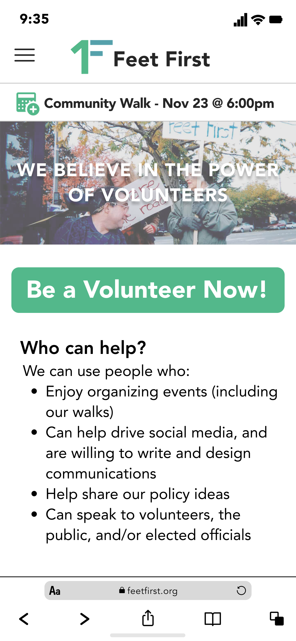
A New Look at Feet First
Feet First is more than just an organization that promotes walking, rolling, and riding. They advocate for safer, healthier, and more accessible communities. With their base in Seattle, Feet First has been at the forefront of advocating for better walkability in the city, while also engaging a diverse range of audiences that include individuals, organizations, businesses, and policymakers.
But Feet First knows that they need to evolve and adapt to a world that's constantly changing. That's why I’m redesigning their brand and user interface, to better reflect their mission, values, and commitment to progress.
A Redefined Icon
The logo primarily uses the type as an image to create the main logo. The unique design features a prominent numeral '1,' which embodies Feet First's commitment to being a trailblazer in the movement for safer, more accessible walking environments. The horizontal blocks that follow this element creatively form the letter 'F,' signifying Feet First's name and dedication to promoting walking, rolling, and riding as essential rights of health.
Not only is the design visually appealing, but it also meets the fundamental criteria of effective branding, being simple, memorable, appropriate, resizeable, and timeless.
Original
Logo Only
Dark Mode
Color Palette
Emerald City Hues: A walkable Seattle color palette
The primary colors for this brand are contained in an analogous blue-green palette: dark turquoise and jade green are used to highlight the climate and area of Seattle.
For the text and other elements, a monochrome material palette brings a sense of sophistication and minimalism without being too overpowering.
Overall, the color palette creates a cohesive and visually engaging representation of Feet First's mission, while maintaining a sense of simplicity and elegance.
Dark Turquoise
#55A1AB
Jade Green
#53B88A
White
#FFFFFF
Ash Grey
#E5E5E5
Crow
#252525
Typography
Avenir Forward: Modernizing Feet First Typography
For Feet First's brand redesign, a typography system was developed to achieve a modern and consistent look while still maintaining readability for all age groups.
The font selected for this project is Avenir, a clean and versatile sans-serif font that strikes a balance between modernity and legibility. To create a cohesive and unified look, the font weight, spacing, and color were adjusted as needed for various applications. This approach ensures that the brand's messaging is communicated effectively across all touchpoints, from digital to print, while also maintaining a contemporary aesthetic that appeals to a wide audience.
Imagery
Bringing Feet First to Life
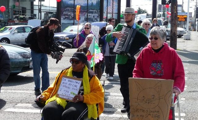
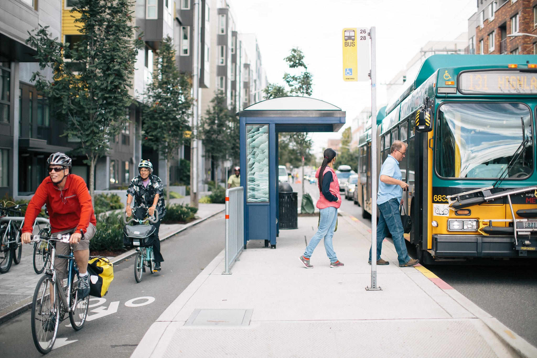
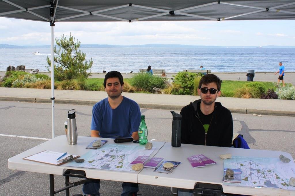
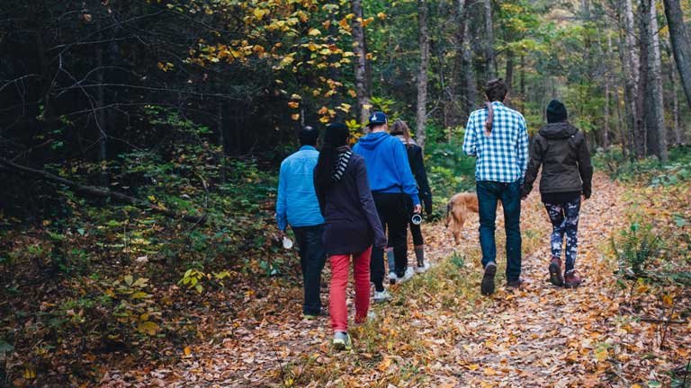
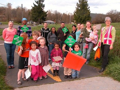
To better convey the mission and community-focused message of Feet First, we carefully selected new imagery that captures the essence of the organization. The images used are real, candid photos of people participating in Feet First events in and around Seattle. By using images of actual participants and locations, we can showcase the organization's impact in a more relatable and authentic way.
The images are intentionally chosen to feature diverse groups of people of all ages and backgrounds, highlighting the organization's commitment to inclusivity and accessibility. They also showcase various locations around Seattle, which helps to connect the organization's work with the local community and environment.
Overall, the new imagery for Feet First is designed to bring the organization to life and showcase the real people and places that make the organization so special.



Graphic Elements
Feet First's website will utilize a range of graphic elements to help create a cohesive brand identity that is both visually appealing and intuitive.
Icons are left empty for a clean material look while buttons are rounded to give a smooth and organic feel. Arrows have been used throughout the site to indicate potential motion, such as moving on to a new page or opening dropdown text from an accordion.
This attention to detail will help to create a seamless user experience for visitors to the site and ensure that Feet First's brand identity is consistently communicated across all touchpoints.
Carousel Indicator
Icons
Accordion
Buttons
Mobile Task Flow
Sign-Up to be a Volunteer
The key user task is to sign up to be a volunteer. This task is vital to the organization as volunteers play a crucial role in executing their events and initiatives. However, the current process for signing up to be a volunteer on the Feet First website has several pain points that need to be addressed to make it a smoother and more user-friendly experience.
The first pain point was that the user was forced to navigate back and forth between pages with an unintuitive vertical menu. To solve this, I reformatted the navigation menu to appear from the left side, having a more natural feel with a clear type hierarchy of the currently selected page. Additionally, I added ‘preview cards’ to give the user information on what each section was about without having to click on each page.
The second pain point was that the site would use too many out-of-proportion images that would require the user to scroll a lot before viewing the desired content. To solve this, I used smaller-height page banners and photo carousels to create a balance of text and imagery.
The third pain point was that the site had little guidance on how to get involved with the organization. To solve this I added a ‘join mailing list’ button to the navigation menu as that is their primary form of contact. Additionally, I redesigned the ‘Volunteer’ page to have a direct call to action button that leads to a pop-up with pre-populated examples to guide older demographic users' survey answers.
Wireframe of Current Mobile Task Flow with Critques
Low Fidelity Wireframe
As I began to conceptualize the redesign of the Feet First website, I created low-fidelity wireframes as a way to map out the changes I wanted to make. These wireframes were essential to the process as they allowed me to quickly experiment with various design ideas and explore different ways of presenting the information.
Using the wireframes, I created an example task flow that outlines how a user may proceed to sign up as a volunteer on the redesigned website. By focusing on the user's journey and experience, I was able to design a website that is intuitive, user-friendly, and streamlined.
Wireframe of New Mobile Task Flow with Annotations
High Fidelity Prototypes
After revision, I was able to finalize some high-fidelity frames and create an interactive prototype on Figma.
New Mobile Task Flow
New Home Page
The user taps the hamburger menu icon in the top left
Navigation Menu
The user taps the ‘Get Involved’ category
Section Previews
The user taps anywhere in the ‘Volunteer’ category card
Sign-Up Button
The user taps the ‘Be a Volunteer Now!’ button
Volunteer Survey
The user fills out a survey using the example expected answers to guide them
Applied Samples
As part of the high-fidelity prototypes, I created two applied samples: a sign with the new logo that could be used for a building or an event, and a volunteer badge that could be used to identify volunteers at Feet First events. These samples allowed me to see how the new branding and design elements would look in a real-world context and ensured that they were cohesive and /.
Street Sign with New Logo
Volunteer ID Badges
Reflection
This project was my first time working on a complete brand redesign, and I found it challenging but rewarding to bring a fresh new look to an organization that is local and driven for a good cause.
One of the biggest challenges I faced was finding a balance between modern and readable typography that still felt approachable to older demographics. I spent a lot of time experimenting with different fonts, weights, and colors to create a cohesive and inviting look. I also had to learn how to incorporate the brand's new color palette into the design in a way that felt both fresh and consistent with the organization's values.
One of the most exciting parts of the project was creating applied samples, such as a sign with the new logo on it and a volunteer badge. Seeing the brand come to life in the real world was incredibly satisfying and helped me ensure that the design elements would work well across a variety of applications.
Given more time, I would have liked to conduct additional user testing and gather more feedback to ensure that this redesign was the best it could be. Regardless, I'm grateful for the opportunity to work on this project and excited to see how the new brand will be received by users.


